Color and typography
Using color and letterforms to carry a claim the words do not make: one side red and the other white, the enemy's name in a foreign-looking face, the key word in capitals so that the eye obeys before the mind has read.
Color and type are read before words are. A sheet that is red, white, and black has already said "ours" or "theirs" to an audience that knows the code, and a word set in capitals, italics, or a second color is underlined by the typographer rather than argued for by the writer. The audience experiences emphasis as importance and color as feeling, and neither can be answered because neither was said.
Regimes build color codes on purpose: red for the revolution, black and red for fascism, the party colors on every surface until they mean the party. Type does the same work in a smaller register, Fraktur for Germanness until the Nazis banned it in 1941, Gotham for a candidate who wanted to look like the present tense. Exploits Framing Effect and Mere Exposure Effect.
Historical examples
In Lissitzky's "Beat the Whites with the Red Wedge" the civil war is two colors and two shapes: a red triangle driving into a white circle. The sides were already called Red and White, and the poster made the names into a diagram in which one color is sharp and alive and the other is round and pierced.
Bonnell, Victoria E. Iconography of Power: Soviet Political Posters under Lenin and Stalin. Berkeley: University of California Press, 1997.
After two decades of treating blackletter as the German script, the party reversed itself: a circular from Martin Bormann's office in January 1941 declared Fraktur a "Jewish letter" and ordered a switch to roman type, which the regime now needed for the occupied countries to read. The same letterforms had carried the opposite argument the year before.
Bain, Peter, and Paul Shaw, eds. Blackletter: Type and National Identity. New York: Princeton Architectural Press, 1998.
In advertising and commerce
The campaign set every sign, sheet, and screen in Gotham, a typeface drawn in 2000 from mid-century American signage, and in one blue. Design critics credited the consistency with making the candidate look like a settled brand before he had won anything; later campaigns on both sides copied the method.
Rawsthorn, Alice. "Obama's Campaign Typeface: A Study in Consistency." New York Times, April 2008; Hoefler & Co., "Gotham" type specimen.
In the archive
Posters and advertisements annotated with this technique.
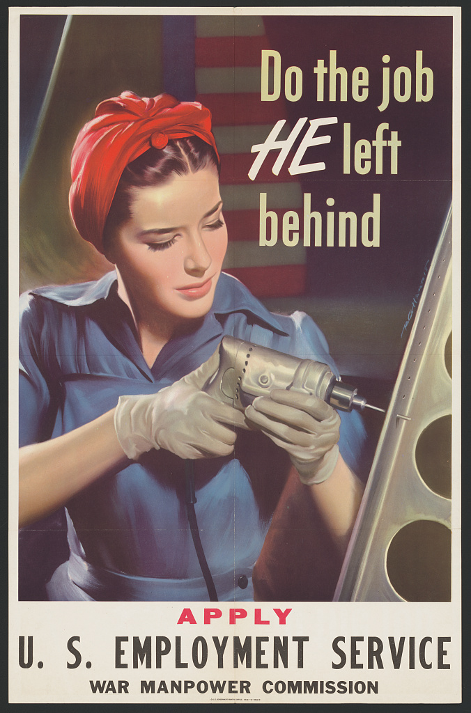
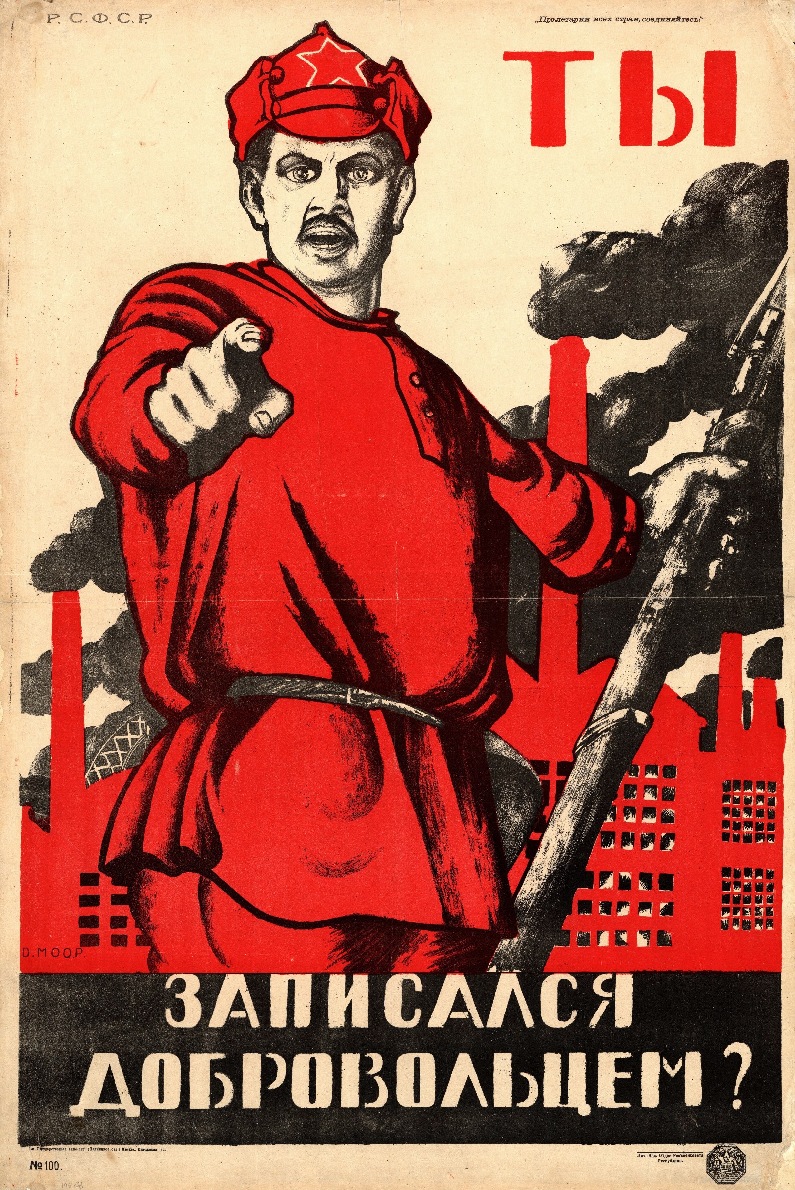
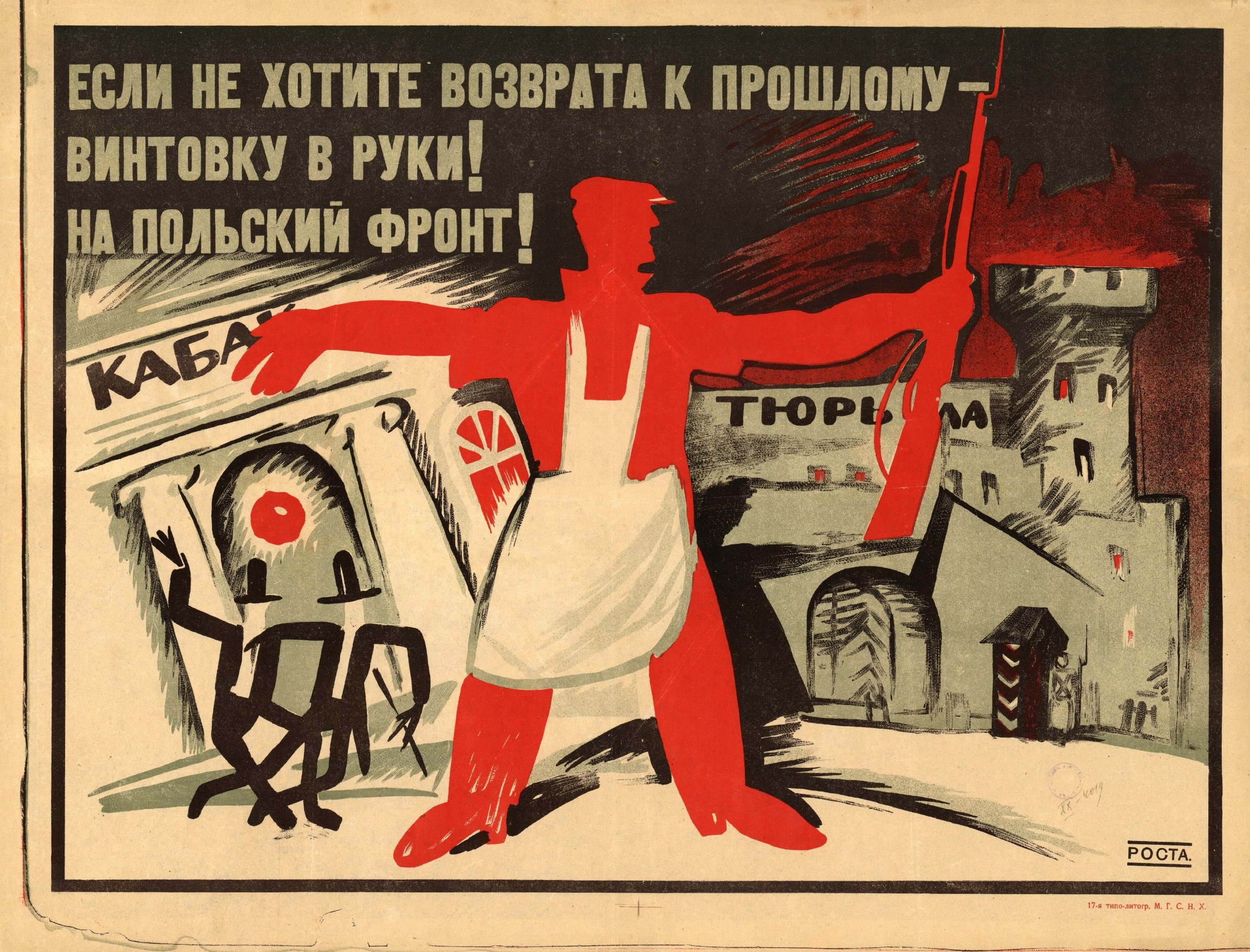
Take a poster and list every color choice and every change of type size or weight. For each, say what it tells the viewer that the words do not.
In the wild
Short examples of the technique at work, each with what to notice. The same examples are questions in the quiz, where the answer is not given away.
A leaflet prints the home side's name in warm gold capitals and the opposing party's in a thin gray face that looks like a typewriter's.
What to notice. Nothing is said about either party; the type has made one side solid and the other faint.
A health poster sets the word "NOW" in red at twice the size of the sentence it belongs to, with no other red on the sheet.
What to notice. The red capital does the urging; the sentence itself gives no reason for haste.
A campaign's ads set the opponent's name in a blackletter face used on nothing else in the campaign's output.
What to notice. The letterforms suggest a foreign or antique allegiance that the text does not claim.
Sources
- Bonnell, Victoria E. Iconography of Power: Soviet Political Posters under Lenin and Stalin. Berkeley: University of California Press, 1997. ISBN 978-0520221536
- Bain, Peter, and Paul Shaw, eds. Blackletter: Type and National Identity. New York: Princeton Architectural Press, 1998. ISBN 978-1568981253
- Kress, Gunther, and Theo van Leeuwen. Reading Images: The Grammar of Visual Design. 2nd ed. London: Routledge, 2006. ISBN 978-0415319157